Tuesday, 16 April 2013
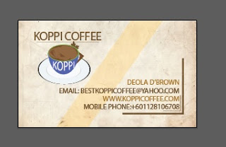
The Logo design for a new coffee brand, is entirely my brain child and after serious brainstorming I came up with the design idea as shown above. I constructed every part of the art myself except for the green plant which i imported and the jug background.
However the concept and style is my production. Not very professional but at least it is somewhere to start with and thus brown coffee to depict the richness of the brand
I decided to use a catchy and attractive image and colour so i came up with the blend and colour contrast as shown.
The green plant shows it is safe and natural no additives and fresh to have at anytime.
Tuesday, 26 February 2013
Tuesday, 19 February 2013
Wednesday, 6 February 2013
Tuesday, 5 February 2013
Design and Layout: Balanace
Design and Layout: Balanace
Balance is the equal distribution of visual weight in a design, balance occurs aroun a vertical axis.
Blance gives emphasis and contrast to a design and if used properly can give certain desired effects.
There are 4 major types but here only 3 will be discussed.
1. Symmetrical or formal balance: This is known as bilateral symmetry, it is created by repeating the reverse of a design on the opposite side of the vertical axis, each side in essence becomes the mirror image of the other.
Symmetry achieves balance through repitition and it is considered as a formal, stable and quiet but quite boring design.
It is commonly used in architecture and product design.
Example:
source: https://blogger.googleusercontent.com/img/b/R29vZ2xl/AVvXsEgqiWqe37luup9AcrrnhvcBaAGw8_ep_PsaONVbXeRrG1QgJymhDBpb8Skzx4cNcB8mbzdYZDl29AnP43SHWryqyTNZgi9h69IUpiEnv6Cfl_0nOhyY5Nq9Nj_puBb6DW-3JKRft9IN3-w-/s400/daniel-craig-james-bond.jpg
The example above illustrates symmetrical balance because, it can be symmetrically divided and balanced visually on both sides.
The example above illustrates symmetrical balance because, it can be symmetrically divided and balanced visually on both sides.
2.Asymmetrical balance: This is a causal, interesting and more dynamic form of balance, it is usually informal and involves different elements that have equal visual weight, the weight is equal but the elements are not identical.
It generally achieves balance though contrast.
Example:
source: http://ifiwereasnowman.files.wordpress.com/2009/11/guesswhoposter.jpg
The design above is asymmetrically balance because of the coherence in space and weight and the balance of space of the empty seat is complemented by the type contrast above the seat.
source: https://blogger.googleusercontent.com/img/b/R29vZ2xl/AVvXsEgppeub8PbiJvDjuROJ1wrJYGt_jKhdMPT8d47uOvAlxpPNvZ92JO1sIQHENlRg35y_UCrzDphsbXBM3nJDQ94KpyE8o0_d14WLzeokSV4rhlG1__uEvvsygm5ET9lKivYnbPOvuCE5pFE/s1600/Asymmetrical+Balance.png
The design above is asymmetrically balance because of the coherence in space and objects as the many littl tiles and space is complemented by the one large piece and space on the other side.
3. Radial balance: This occurs when all the elements radiate out from a central point and the visual weight is distributed equally. It creates a strong focal point in the center of the design.
Example:
source: http://3.bp.blogspot.com/-2PlPD1QlsW8/UGX6V6M3zMI/AAAAAAAAADg/53nq3ZBbEN0/s1600/6346490_orig.jpg
The design above is radially balanced by the equal amount of weight and balance of space all originating from the centre.
source: http://faculty.rcc.edu/hewitt/Adobe_Photoshop/Balance/WIRED_Magazine.jpg
The design above is radially balanced by the equal amount of weight of the photos and balance of text and colour all originating from the centre.
Tuesday, 29 January 2013
CONTRAST WITH SIZE
This contrast in size depicts authority and power as the weaker or smaller subject looks up for protection and support.
CONTRAST WITH COLOUR
The contrast with different colours depicts importance and attention to the logo, and gives it meaning, and also solidifies the image with a brand.
CONTRAST WITH TONE VALUE (SHADOW)
source: http://thumbnails.illustrationsource.com/huge.7.35775.JPG
The tonal Value of the design creates a contrast between the man and his inner self, showing who he really is inside.
CONTRAST WITH TYPE
source: http://29letters.files.wordpress.com/2007/09/imarat-display.jpg?w=460
The use of different typeface and font creates meaning different meaning and draws attention to certain part of the design
CONTRAST WITH SHAPE
The use of different shapes in contrast, draws attention to the circular shape
Create and write a post on "Contrast". Provide a graphic design example(Ad, Poster,Logo e.t.c) for the contrast techniques below with explanations on how they are used.
- Contrast with Size
- Contrast with Colour
- Contrast with Tone Value (Shadow)
- Contrast with Type
- Contrast with Shape
Provision of online references will be made to site sources.
Subscribe to:
Comments (Atom)


.jpg)


.jpg)
.jpg)

.jpg)
.jpg)


